Friday, October 29, 2010
Ranch: Process
Public space:
A large wooden door accented with stain glass greats the occupant as they enter the home. The stain glass represents, in color, an abstract form, of the interior floor plan and color schemes. This way the user is interdicted by the space upon their arrival. The materials found in the foyer are: polished concrete floor, sage colored walls, dark cherry wood accents such as shelf’s and mud room style bench. This room or the “green” room was designed to give the occupant’s eyes time to adjust from the harsh exterior natural lighting to the now, dimmer, electric lighting.
Adjacent to and in contrast with the “green” room is the living room- or “red” room. The elements found in the red room are mostly comprised of highly reflective surfaces, both the fire from the fireplace and the sun’s light will reflect off the polished white concrete floor. Even the furnishings are quite reflective. The step-down into this split-level room has been changed to a ramp to reinforce the bending of light that takes place in the public spaces. In the living room there is a large piece of wall art created out of cardboard and recycled brown paper; above are yellow and red recessed lights, when on the wall becomes a theatrical light show. The fireplace mantel possesses a mimicked stone pattern similar to that of Frank L. Wright’s previous works. I took inspiration form him because he believed that the fireplace is the hearth of the home and, in plan, the fireplace lies centrally in the ranch home. I also took from Robert Venture’s designs the proposal of making the fireplace and staircase one, so as to maximize space. Here, in the “red” room I moved the step-up riser all the way to the right so that it could be next to the fireplace as the floor plan moves into the dinning room- or “yellow” room.
To the right of the living room is the dining room. Here the predominant colors are white and yellow. I tried to let yellow act as the inspirational color that pops into the space, rather then allowing it to consume the space. In an effort to create interesting shadows and color change, I used translucent yellow chairs over which polished concrete floors. The walls are made of an attractive paneling system by Iconic Walls entitled “broadcast” the paneling comes in all white, however, I intend on painting bands of yellow in the concaved parts of the wall paneling to enhance the charm of the room.
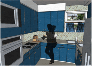
Both the “red” room and the “yellow” room will be linked to each other through the lighting systems. In plan the North wall joins the living room and dining room spaces together, I plan on allowing them to shear the same drapery system. On the ceiling two ribbon like light fixtures will be attached to a pulley system to control the amount of electrical light that is carried into each space (please refer to illustration). Next to the dining room is the den, which also continues the yellow scheme. Coming full circle, the kitchen or “blue” room is comprised of retro style wallpaper, Ice Block countertops, white polished concrete floors and blue cabinetry.
Privet space:
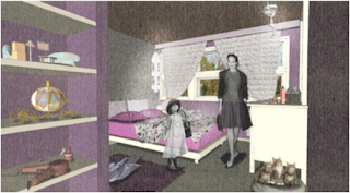
Relating back to my inspirational art piece, Philadelphia, I have determined that the gestural lines in the work will act as the preexisting wall structures and the bright blocks of color best respond to high traffic areas like those in the public space. Thus, turning the white and gray tones in the painting into the more relaxed privet spaces of the home; such as the master bedroom, baths, and children’s rooms (please refer to scenes).
Monday, October 18, 2010
Friday, October 15, 2010
Wednesday, October 13, 2010
Tuesday, October 12, 2010
Ranch: Precedents II
Ranch: Precedents
I had an epiphany! After continuous thought and dissection of Howard Thomas’ piece entitled Philadelphia I have come to the conclusion that my concept must have something to do with gesture, movement, stability, and structure. I also observed that in the Philadelphia Thomas used stable blocks of color, this immediately reminded me of my past experiences in yoga. I thought about how the body is in conscious movement with breath (gestural line) and yet the spirit and mind can be renewed or at rest (blocks of color). I haven’t yet decided exactly what my concept will be called but it will most definitely be one of the following.
Anusara Yoga is a relatively new form of yoga (1997), which pairs strict principles of alignment with a playful spirit. Postures can be challenging, but the real message of Anusara is to open your heart and strive to connect with the divine in yourself and others.
Ashtanga (or Astanga) Yoga is the name given to the system of yoga taught by Sri K. Pattabhi Jois. This style of yoga is physically demanding as it involves synchronizing breathing with progressive and continuous series of postures-a process producing intense internal heat and a profuse, purifying sweat that detoxifies muscles and organs. The result is improved circulation, flexibility, stamina, a light and strong body, and a calm mind. Ashtanga is an athletic yoga practice and is not for beginners.
Kripalu is called the yoga of consciousness. This gentle, introspective practice urges practitioners to hold poses to explore and release emotional and spiritual blockages. Goal-oriented striving is discouraged and precise alignment is not as important as in some other traditions. There are three stages in Kripalu yoga. Stage One focuses on learning the postures and exploring your bodies abilities. Stage Two involves holding the postures for an extended time, developing concentration and inner awareness. Stage Three is like a meditation in motion in which the movement from one posture to another arises unconsciously and spontaneously.
Vinyasa: Focuses on coordination of breath and movement and it is a very physically active form of yoga. It began with Krishnamacharya who later passed it on to Pattabhi Jois.
http://www.matsmatsmats.com/yoga/yoga-disciplines.html#back
"the bending of light to create shape and shadow"
Tuesday, October 5, 2010
Ranch: Painting

Howard Wilbur Thomas was an artist and a teacher, a professor and an administrator to several different universities but most importantly to the Women’s College; or as we know it today, UNCG. Thomas’ career began as a figurative painter but later in the 1940’s transformed to the currently popular abstract styles of art.
His work shown above, Philadelphia, conveys the artist’s focus on combining gestural line with blocks of color. It is interesting that Thomas was able to transform his knowledge of line in the human figure to his understanding of shape and gesture in his newer investigation of abstract art.
The immediate design elements that one may perceive from this painting are: line, space, form, harmony, balance, unity, texture, color, and parts of a hole. It is my anticipation to use this image toward guiding me thought the ranch project as I observe the differences between private and public spaces.
By simply gazing at this piece, notice how all the color pieces are outlined or enclosed by line. Much like materials and textural differences in a space can act as the great divide between private and public areas. Also discern how and why the white spaces seem to be separate from any of the other colors yet appear to harmoniously flow throughout the entire composition.


